I love typefaces. I love typefaces. I get an email from this company, and I go all quivery with type-lust. I want to fire up InDesign and make a big poster just to use the font.
Screw Times Roman and Helvetica, and don’t even talk to me about Arial or Comic Sans. Bleagh.
Give me Cyan  …
…
or P22 Cezanne  …
…
or High Society  …
…
or Young Finesse  …
…
or Leaf 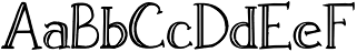 or…
or…
You get the picture. When I was in high school, my girl friend actually gave me an ITC catalog for my birthday. It’s that bad.
So it was with great anticipation that for Christmas last year I gave myself a daily calligraphy calendar. Its premise was that every weekend it would give you a new typeface, and then the week would be spent lettering words that were grouped thematically. What fun, eh wot?
I should have been tipped off when the description on the back of the box simpered, “See if you can guess the theme for the week!” The typefaces were not very exciting, some of them required a brush and ink, not the kind of thing one wants to deal with in the bathroom first thing every morning, and some of them contained egregious errors, e.g., their attempt at an uncial font had a majuscule A and H rather than minuscule. (And you thought I couldn’t get worse.)
Not only that, but after six weeks, the typefaces repeated! What a rip-off! So I lost interest mid-February and have only desultorily pulled the looseleaf pages since then.
I was mildly curious this weekend, gazing on the umpteenth repeat of a swash style, as to what the theme would be this week, especially for today, the fifth anniversary of the terrorist attacks on New York and Washington. And it was therefore with slackjawed stupefaction this morning that I pulled the weekend’s page and saw today’s word: Airplane.
I am not easily shocked, as most of you know, but that was a weird way to begin the morning. The rest of the week had words like propeller, pilot, that kind of thing, but damn, people, did no one think? I would hate to be their email editor this morning.
I may have to go buy ArDeco 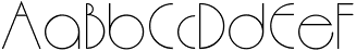 or Chato Band
 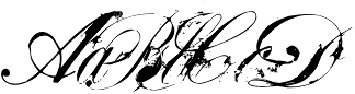 just to get the bad taste out of my mouth.
That last one looks like instead of Chato Band it should be called Lotso Smudge.
It’s called a “grunge font.” Those are fun to use in moderation.
Except for Cyan, maybe, none of these that I’ve shown are book fonts. I wouldn’t set anything but posters or perhaps titles of handouts or bulletin boards with them. There’s nothing I detest more than people who misuse display fonts, setting their programs in some elegant but quite illegible engraved calligraphy font. I’m looking now at a poster across the library that I just made, a list of words that “Mr. Lyles does not understand and cannot help you with,” including stuff, thing, the information, etc. I set thing in a nice chancery script, and I can’t read it from here. Reprint!
And may I say I love my new wide-format printer, with 24″ paper on rolls!
Do Grunge fonts originate in Seattle and wear untucked flannel shirts?
And baggy pants with no underwear.
Cezanne is great, but very hard to read. Still I’ve managed to use it successfully on a few projects including Warren Budd’s new book that will be coming out soon.